The Iron Network
The Iron Network is a dynamic community where young professional women build meaningful connections – through shared learning, intergenerational solidarity, and a vibrant support network. They are redefining how women connect, inspire, and empower each other.
-
We were tasked with developing The Iron Network's brand identity with a holistic approach that spans both print and digital platforms. Our strategic goal was to craft a bold, confident brand that celebrates the strength and power of a support network.
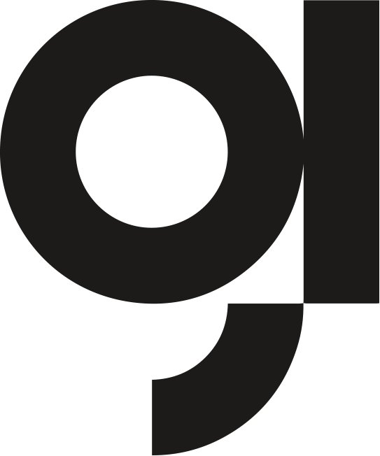
At the core of this identity is a distinctive brand symbol. By merging the letters "i" and "n," we’ve created a visual shorthand that subtly references the brand's name, while also incorporating an abstract magnet shape, symbolizing connection and attraction. This dual-purpose design serves as a quick and memorable visual identifier, yet its simplicity ensures versatility, allowing it to be applied seamlessly across a wide range of formats.
To engage the audience on a deeper level, we’ve layered in dynamic collage illustrations throughout the brand’s assets. These illustrations, rich with texture and color, represent the diversity of connections within the network and evoke a sense of collaboration, community, and innovation. The collage style adds a tactile, human element to the brand, making it feel approachable and creative, while still maintaining the bold and confident tone of the overall identity.
This approach not only reflects the values of The Iron Network but also ensures the brand remains engaging and relevant across both digital and physical touchpoints.
We delivered
Brand Identity
Creative Direction
Website Design & Development
Printed Collateral